How to Avoid the Most Common Design Mistakes
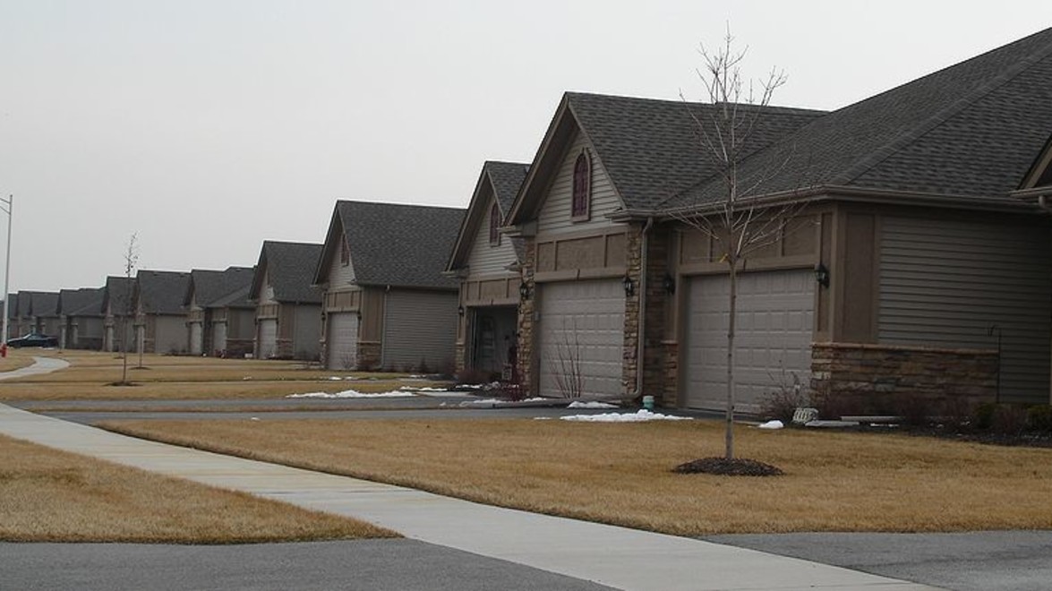
When driving down the average residential street, it is surprising to see the similarity of front yard landscapes. Although these landscapes may meet the minimum functional necessity, aka a walkway that gets you from point A to point B, the design often lacks style and proper proportion compared to the style and size of the house.
Here is a list of common design mistakes to be avoided, please click on photo above to view slideshow:
### Open-Ended Front Lawns
The typical property has a house in the centre with a large, open front lawn. Typically there may be a plantings right against the house and possibly a tree in the lawn. Visually this makes the lawn look like no man’s land and often blends into the neighbor’s properties who have the exact same landscape.
This can be solved by adding defining edges with garden beds or walkways extending from the front of the house scaling the lawn to a proper size.
### Driveway Dominates the View
The driveway is often visually dominant when looking at the front of a house, especially with smaller houses or townhouses. This takes the attention away from the front door which should be the focal point. Also, when cars are parked in the driveway, there is usually little space to get out of the car before meeting lawn space.
The solution to this problem is to create a wider walkway incorporating it into the driveway and leading it all the way up to the front door. Plantings can also enhance the walkway and make it more visually appealing.
### Narrow Entrance Walkways
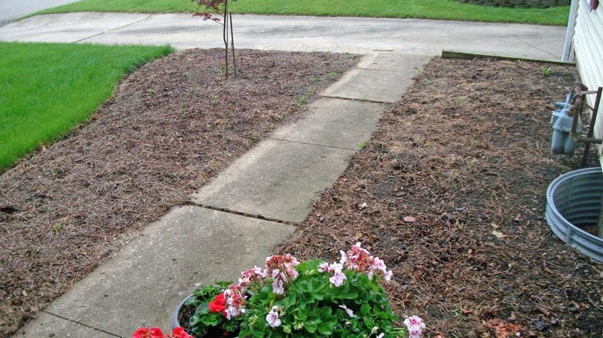
Often the walkways leading up to the house are far too narrow, typically three feet wide. This measurement is suitable for walking single file but is not comfortable when two people want to walk side by side.
The standard width for walkways is four feet minimum for two people walking side by side. If home owners have frequent social gatherings at the house, a wider walkway should be considered.
### Limited & Overgrown Foundation Plantings
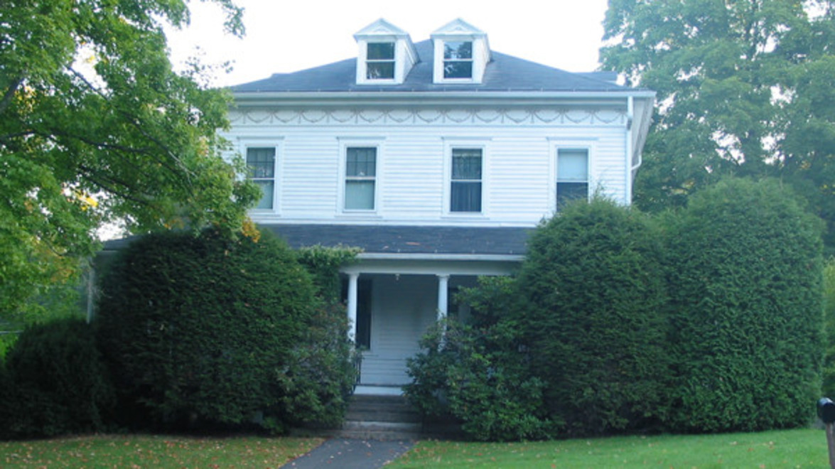
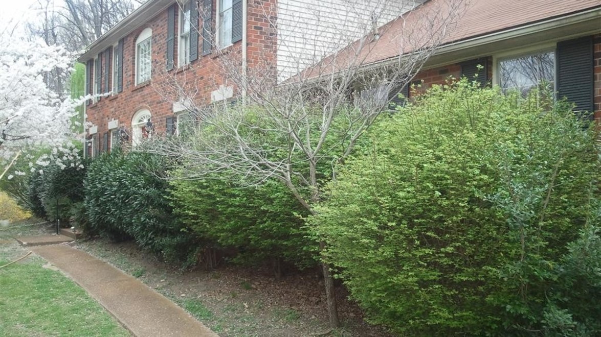
A common site in front yards is seeing the planting limited to the front of the house. This usually consists of a row of shrubs possibly evergreens that are clipped once a year lacking visual interest. Sometimes these shrubs are left becoming overgrown blocking windows and entryways.
This can be solved by installing walkways that are not strictly parallel to the front of the house. Curvilinear or arc and tangent themes create visually interesting bed shapes and walkways. Plant selection is also key, choose cultivars that will not become overgrown in the space they are planted in.
### Repetition, Variety & Colour
An ideal landscape has an equal balance of all these elements. These elements are represented in the landscape with hardscape materials, plants and accessories (furniture, pots etc.). A common mistake seen in design is when one of these elements is either overused or underused. For example, using too much variety can be visually confusing, this can be seen in landscapes where it is obvious the homeowner is a plant collector and has planted one of each plant variety.
Variety is complimented by the right amount of repetition, a fair mix will increase the attractiveness and overall composition of the design. For example, plants should be grouped in odd numbers, masses of three’s, five’s or seven’s are visually pleasing to the eye.
I hope these tips open your eyes to different aspects of design that you may have not taken into consideration before. Just remember, landscapes are outside extensions of our homes. It should represent your personality, style and give you a sense of pride as you reach your house at the end of each workday.
Happy Gardening!
Andrea
*Post contributed by Andrea Weddum, Landscape Designer*
For any questions or comments please comment on our
[Facebook](https://www.facebook.com/GeldermanLandscapeServices) page.

