How often do you consider the impact that strong signage has on the way you navigate your world? It is natural for us to go about our days, travel, commute, shop, dine and never once realize what influenced us.
Of course, other factors contribute to how our day may unfold with technology at our fingertips. Ultimately we seek out what we are looking for by way of a sign. Street signs guide you along your way. Roadside pylons mark the places where we want to go. Monument signs welcome us back to the communities we call home. Signage is your immersive, interactive, real-world roadmap – visual markers that connect people to place.
You have heard the saying never judge a book by its cover. I would argue that. The foundation of good signage is its ability to communicate the intended message on its surface – much like good graphic design. Graphic design is the visual solution to a conceptual problem. A sign serves, very much, the same function. The same considerations of elements and principles – shape, scale, size, colour, composition – are made when developing a signs intended message.
Take a stop sign for instance. The shape, colour, and choice of font were all intentional considerations to communicate that when you approach that sign on the road, you need to STOP. Early stop signs in the 1920s were yellow. If you have read our post about T[he Psychology of Colour](https://gelderman.com/blog/306/the-psychology-of-colour) you’ll know that yellow is the first colour the human eye reacts to. The colour red was later adopted as an international standard. The octagonal shape was utilized to differentiate the back of the sign from other signs on the road. Even the height was a careful consideration. The conceptual problem was the need for people to stop and allow the safe movement of opposing traffic. The visual solution is clear. The types of signage I want to talk specifically about are those found in the landscape, signs that mark the entrance to an establishment, condo development, resort or community. Monument signs are freestanding signs mounted in the ground. They can be constructed using many different materials. Together with environmental graphics and landscape plantings, this form of signage can almost evolve into an element of placemaking (which is an entirely different topic that I may get into later). The point is that good monument signage should be engaging to the viewer. They should represent the brand. They should speak, visually, about what can be expected when entering the environment that the sign communicates for. At the very least they should just be cool to look at.
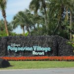
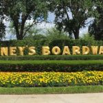
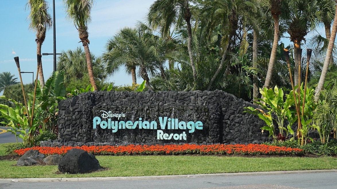
I reflect a lot on my trips to Disney World. It’s my favourite place to visit. Seen here is the entrance to Disney’s Boardwalk Resort, a charming and whimsical shopping, dining, and entertainment venue made to feel like a turn-of-the-century Atlantic City waterfront. This sign sets the tone for the experience – simple, brightly coloured, period specific font complete with beveled edges and speckled embellishments – it is an invitation to immerse yourself. Within the environment, the sign is framed with clipped shrubs and hedges and accented by some seasonal colour. There is a good balance and scale here as well. This next example also comes from the grounds of Disney World. Disney’s Polynesian Village is a South Pacific inspired resort. Here the use of heavy, stacked volcanic rock flanked with lush plantings and accented by some seasonal colour add an element of adventure. A few larger volcanic boulders placed in the foreground create depth and incorporates the sign more naturally into the environment. It is as if this monument has been stumbled upon as part of another journey which establishes a bit of a story.
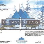
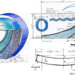
Another example shown here is an elevation rendering by a Calgary based design firm. The concept being developed is for a gateway sign which would mark the borders of Crowsnest Pass. The signage incorporates the town’s logo as the environmental graphic. In the rendering, you can see the proposed use of natural stone and coniferous trees and shrubs. This intentional use of natural elements is being drawn from the local surroundings. The concept uses visual cues from the environment to help solidify the identity of the town in its message. The description on the drawing says exactly that: Indigenous boulder planters and accents to enhance the arrival sequence and blend with context. The following rendering (artist unknown) uses the same principle – using environmental cues to establish context. I am going to go out on a limb here and say that a defining feature of this downtown is its proximity to a large body of water. You could go a step further and say that it might be known for its waves.
The conception of a monument sign is a process that can embrace many design disciplines – architectural, industrial, graphic, and landscape. These disciplines tend to concern themselves with the visual aspects of wayfinding, establishing context within our environment, reinforcing brand identity and energizing space. The examples I have discussed here are ones which, I feel, communicate information and identity, speaking visually about the environment they signify. They were conceived and constructed using design elements which shape the idea of creating spaces that connect people to place.
*Post contributed by [Adam Braun](https://gelderman.com/company/team/58/adam-braun), Guelph Branch Construction Crew Leader*
For any questions or comments please comment on our
[Facebook](https://www.facebook.com/GeldermanLandscapeServices) page.

